Headquarters
175 S Main St Suite 1310,
Salt Lake City, UT 84111


Everywhere you look, people are constantly checking their smartphones to communicate with others, browse the Internet, or purchase items at their leisure. As of 2019, almost 50% of all online shopping occurred via phones. You’d think with a mobile-first audience that retailers would keep up and capitalise on this trend, right? Unfortunately, some brands are struggling to deliver an optimised, mobile-first user experience to their consumers, and it’s impacting their sales numbers.
If your brand isn’t prepared to serve this new wave of mobile shoppers, you’ll fall by the wayside as your competitors reap the rewards. Just one negative brand experience with your company makes a user 62% less likely to purchase from your business again in the future. Some of the most crucial pages on your eCommerce site are your home, category, product, and checkout pages, and these need to be optimised to ensure customers make a purchase and return for future orders.
In this blog, we’ll share what you should be doing on your eCommerce website to make mobile shoppers stick around and make a purchase.
Consumers want a smooth experience when interacting with your brand. If the first thing they notice on your site’s homepage is a constant stream of popup promotions, they may abandon your site altogether. This website abandonment is especially prevalent on mobile shoppers, who will quickly flee if they feel their time is being wasted due to a barrage of unwanted popups.
Given that more than half of all shoppers asserted that they would never revisit a website with a full popup, your company is skating on thin ice if you employ this particular strategy.
Rather than blocking your homepage and asking a user to download your app, use a subtle banner at the top of your page that the user can click on in case they do want to download the app. Google found asking a user to download your app from the App Store actually resulted in a 69% abandonment rate, where users neither downloaded the app or visited the website.
Another way your company can avoid abandonment rates is to not ask users to sign up, register, or provide any personal information unless there is immediate payoff such as a discount. You should only ask for information if it’s absolutely essential.
Consider showing a search icon on the homepage or, if possible, a full search bar. If users can find a search option easily, usage can increase by 13% on mobile and overall conversion increases by 41% on mobile when combined with a clear call to action or category navigation. These CTA buttons, for example, can include links to seasonal collections, top-level categories, and new arrivals. By presenting clear calls to action, your business can increase conversion rates.
Customers are quick to abandon websites due to poor search experiences, and studies have found that 80% of users will leave your website if they aren’t satisfied with the search results. With 85% of searches not returning what the user is actually looking for, this is an area where you can easily gain customer loyalty by offering superior search experiences.
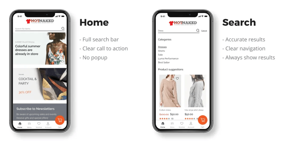
Your company’s homepage should serve as a guide to help customers explore different categories. It’s imperative that your brand’s value proposition is clear while they’re browsing to increase retention, boost conversions, and reduce cart abandonment rates. For example, if you provide free shipping, show the customer using a banner at the top of the page to increase click-through rate.
By using effective filters throughout your website, you will help users quickly narrow down a large list of products to easily find what they’re looking for, directly reducing bounce rates. Users should be able to apply multiple filters where it makes sense to, which is otherwise known as faceted navigation.
Don’t forget about your website’s visual cues, either. Your photos should be clear and consistent throughout your site and category pages. Each product’s photo should take up 80-90% of the product box, and the photos themselves should be consistent with framing and product context. Photos are especially important when viewed on mobile devices.
Customers expect to see a grid of products when browsing on mobile devices, with two products in one row. A common mistake when translating a desktop-first experience to mobile devices on responsive sites is to have only one item per row. This setup requires the user to scroll too much and makes it difficult to quickly skim the product, analyse the offering, and click through to a Product Detail Page.
Consumers’ attention span is short. Your brand must resonate with your audiences and stoke urgency to keep shoppers engaged. Your company should include urgent elements throughout your category pages such as limited-time offers or low-inventory badges on certain products to encourage users to take action now, not next week.
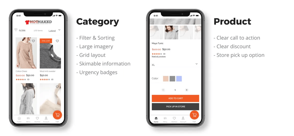
Once customers navigate to your product pages, it’s important to reiterate that sense of urgency we touched upon earlier. Such elements can include free shipping, special offers, or easy returns that clearly demonstrate your brand’s value proposition. These elements should be positioned close to urgent call-to-action (CTA) options like “Add To Cart” buttons to help increase conversions. Websites with this type of value proposition on their Product Detail Pages see a conversion improvement of 17%, and this simple yet effective strategy won’t require much effort to pull off, either.
Your page layout is also critical to your brand’s mobile-first success. Show pricing information for products above the fold. This means the user should be able to see the product’s price without having to to scroll the page. You must make vital purchase information easy to find. Simple, right?
Many brands force customers to hover when zooming on their website. This is another pitfall of designing your site as a desktop-first experience. When this is translated to a mobile experience, users are frustrated since there is no such thing as hovering on touchscreens. Instead. let the user choose to zoom into an image with a button or pinch-to-zoom option.
When shopping for products, consumers don’t want to perform complex equations to determine how much they’ll save by shopping with your company. If customers are saving money on a product, do the math for them. Tell the user exactly how much they’re saving by buying a product right now. For example, if an item is 60% off, show how much they’re saving in dollars, too, if they receive free shipping; be as clear as possible.
Breaking down barriers for customers can also translate into product availability. Your business should show users nearby stores that carry your products. If someone is interested in an item, but doesn’t want to pay for shipping, this inventory option can help improve your conversions. Your business can default to the users’ current location, but ensure it’s easy to edit by entering their zip code or city.
Lastly, your product page’s success on mobile devices hinges on timely shipping. Customers’ decision-making processes depend on the timeliness of when they’ll receive an item. Your company’s product pages should clearly show shipping times to ensure there isn’t any confusion.
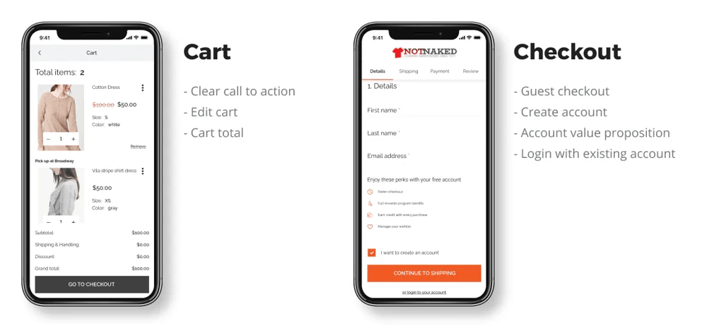
The final step in a customers’ mobile-first experience is the checkout process. When users add a product to their cart, don’t redirect them to the cart; instead, let them know the product was added to the cart but let them continue to browse your site and add more products to their cart. By not redirecting customers to the cart, brands have seen average order value grow by 4%.
Although customers always have their smartphones nearby, let them email their shopping carts to themselves. Some users may still prefer to make sensitive purchases on their desktops. By giving them the option to email their carts, you also give the user the freedom to complete their purchase later rather than abandon their purchase altogether.
Other ways your business can optimise the checkout process include clear, actionable call-to-action (CTA) options. Make sure you offer CTAs at the bottom of mobile shopping carts to reduce abandonment rates. Also provide ways for shoppers to check out anonymously, as 35% of users will abandon their carts if they can’t purchase anonymously. Use labels instead of placeholders to help users remember context during checkout.
For returning customers, a frictionless experience is also a necessity. Provide alternative options for users to log into their accounts. If a user can’t remember their password, they’re likely to abandon their cart altogether. Allow users to use social login so they don’t have to always remember their passwords to access their accounts.
Other ways your brand can remove any checkout barriers on mobile devices is to include autocomplete forms and contextual keyboards. For example, when asking users to input their phone number, default the keyboard to the number pad, auto capitalise the customer name fields, and use Google’s address auto-completer to expedite this process.
By optimising your checkout forms with clear CTAs, having correct input types, and using labels instead of placeholders, your brand can increase your mobile transactions by 51%. Impressive, right?
* * *
Customers have gone mobile, no doubt about it. With mobile users becoming the dominant source of eCommerce traffic, it’s important that your website caters to them first, rather than designing experiences around the desktop. These mobile-first recommendations can be implemented on your existing mobile site without re-platforming or undergoing any major tech overhauls.
Find out more about these mobile-first enhancements from sources such as the Google Retail UX Playbook and the Experience and Design series. In addition to these assets, Hotwax Commerce can help your company become a mobile-first brand. With this Figma file, we created a detailed design system for a mobile-first eCommerce experience that you can download and check out in detail. It comes with premade screen templates for omnichannel mobile commerce, and the designs are fully customisable using a vast component system.
If that wasn’t enough, HotWax has already built-in these Google UX guidelines into our platform. Our Digital Commerce offering is ready out of the box with Omnichannel Mobile Commerce that’s built on progressive web app (PWA) technologies. PWA technologies have great benefits in this day and age of mobile-first experiences, and it's backed by Google. Read more about PWAs in our previous blog, or contact us today to transform your customers’ mobile experience.


175 S Main St Suite 1310,
Salt Lake City, UT 84111